Data Viz Superpowers
3#Data Viz Superpowers

3.2 Lesson planning
Since the modules are independent from each other, it is not necessary to be acquainted with the previous modules to tackle this one.
This module has been developed in collaboration with Aida Horaniet Ibañez, a doctoral researcher at the Luxembourg Centre for Contemporary and Digital History (C²DH) at the University of Luxembourg.
- Target audience: 5e-7e
- Room: can be presented using a video projector.
- Equipment required: each pupil needs a tablet or computer in order to access the different links.
- Time: 2 hours of teaching time.
Data visualization is everywhere nowadays. Diagrams, tables, and graphs are the most common and simplest forms of visualization. The combination of different types of visualizations and information is called “infographics”.
The National Report on Education in Luxembourg is a good example of the use of infographics. It contains data and complex facts about the school system and education in Luxembourg and explains them in a graphic form. Data visualizations are used in the report to present the facts in a clear way and to shed light on different trends. As is often the case, different forms of visualization are used in the text to convey different messages:
• column and bar charts are used to clarify the relations between the different data and enable us to make comparisons between the numbers;
• pie charts illustrate different parts of a whole;
• curves are used to demonstrate the evolution of key figures over time;
• maps make it possible to show geographical data visually.
Nonetheless, as this module shows, the modern world of dataviz has many possibilities.
According to Edward Tufte (Tufte, 2001), statistics professor at Yale University, a good dataviz gives the viewer the maximum number of ideas in the minimum possible time, using as little ink and space as possible. It has to show data without deforming them, and it should invite our eyes to compare different elements of the data.
Data visualizations make the invisible visible, and reveal the hidden structures behind data. This is why Wesley Willett and Petra Isenberg talk about “superpowers” (Willett et al., 2021). Superhero comic books often feature characters with fantastic powers which enable them to see and interpret the world in a way that transcends normal human perception. Willett and Isenberg demonstrate how the language of superpowers can be used to characterise the different modes of visualization that currently exist. They describe a series of “visualization superpowers” which make the invisible visible.
The relevant “superpowers” in relation to school work are, above all:
• “enhanced attention”, allowing pupils to distinguish between relevant and irrelevant information;
• “enhanced comparison” which helps pupils make appropriate comparisons between different data;
• “enhanced prediction” which helps pupils make well-founded conjectures about the future;
• “enhanced memory” enabling pupils to use dataviz to tell stories.
Researchers also warn us against the danger of data being manipulated. There is the possibility that numbers and information might be presented in a way that transforms the “truth behind the data” into nonsense.
Pupils know what data are and are able to recognise them. They are also able to collect and classify data. They know the advantages of good dataviz, but are also aware of the power to trick people through the manipulation of graphs.
Pupils have seen at least one example of a dataviz that is more creative and unusual than more common styles of graph.
Target skills from the Media Compass¹
- Competences 1 – Information and data: 1.1 Filtering and researching data, information and digital content, 1.2 AAnalysing and assessing data, information and digital content, 1.3 Storing and managing data, information and digital content, 1.4 Processing data, information, and digital content
- Competences 2 – Communication and collaboration: 2.1 Working with others
1https://www.edumedia.lu/medienkompass/medienkompass
Whether in our everyday life or in the field of research, we are confronted by ever more enormous amounts of data. Sometimes, data visualization is the only way to understand these data and draw useful conclusions from them. Now, in the twenty-first century, it is therefore important to be familiar with the basics of dataviz and know how to use it.
For a given question, pupils are able to extract non-structured numbers, essential information and data, and to explain how they made their choice. They learn how to carefully compare the different data, and to reach new conclusions on the figures. In doing so, they may realise that comparisons do not just happen by themselves, but that they are made by human beings. Moreover, pupils learn to recognise what can be predicted using data and numbers.
They increase their ability to use data and numbers in a critical and confident way. Moreover, they become aware of the potential dangers of data manipulation.
Pupils learn to recognise the different types of data (quantitative, categorical, discrete, continuous) and practice making links between them. Using examples, they also learn about the different possibilities for data visualization.
The lesson contains 16 exercises.
The lesson starts with an Instagram post from Cristiano Ronaldo (exercise 1). Pupils complete exercise 1 in pairs. Then they discuss their answers and reflection with the rest of the class in a moderated discussion. It is important to make a distinction with the pupils between, on the one hand, the data relating to the photo itself (e.g. the colour of Cristiano Ronaldo’s shirt), and on the other hand, the data linked to the Instagram post (e.g. the number of likes, the verified Instagram account, publication date, the fact that the photo is the first in a series of four, etc.).
All the data that the pupils find is then noted on the board or in a digital word cloud.
Exercise 2: The point of this exercise is to classify the data by category and type. The data that pupils identified in exercise 1 are taken and classified according to the different categories which are explained.
Exercise 3: Exercise 3 checks whether pupils have understood exercises 1 and 2. Pupils should complete exercise 3 individually.
Exercise 4: This exercise provides a simple demonstration of how to make a table and organise data. The topic of football players should motivate pupils to complete the table. Pupils can use the internet to search for any missing information. The completed table should look like this:
| Player | Club | Year of birth | Nationality | Favourite dish |
|---|---|---|---|---|
| Cristiano Ronaldo | Al Nassr | 1985 | Portuguese | Bacalhau à Brás |
| Lionel Messi | PSG | 1987 | Argentinian | His mother’s Milanesa Napolitana |
| Neymar Jr. | PSG | 1992 | Brazilian | Italian and Japanese |
| Kylian Mbappe | PSG | 1998 | French | Tiramisu |
| Zlatan Ibrahimovic | Associazione Calcio Milan | 1981 | Swedish | Falukorv |
Exercise 5: In this exercise, the pupils themselves have to collect data about their classmates. Walking around the classroom and mingling with each other gives pupils a bit of breathing space. The teacher can let pupils choose their own topics, or can set a theme: social media, football, the use of smartphones, etc. The choice of topic can be used to link the module to the course of Digital Sciences.
Next, we move onto superpowers. In the following exercises, pupils will become familiar with the dataviz superpowers. This section is inspired by the article (Willett et al., 2021). Exercises 6 to 10 serve to illustrate the three first superpowers. For these exercises, pupils first work individually, and then they discuss their results in a moderated discussion. The 4th superpower (enhanced memory) is a bit different: for this exercise (exercise 11), we suggest that pupils work in pairs and then collect their answers together.
The penultimate section is probably the most important: exercises 12 to 15 show the four main techniques for manipulating graphs.
In exercise 12, the baseline has been manipulated. When we use a bar chart, the baseline should start at 0. By starting the baseline at another point, we can manipulate how the numbers are perceived. The same graph as in exercise 12, with a y-axis starting at zero, would look like this:
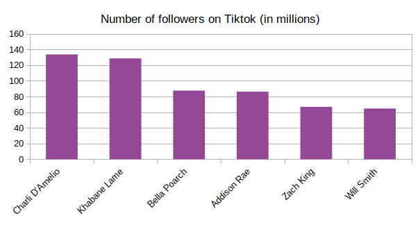
Here, we can clearly see that it is not at all true that the first two TikTokkers have twice as many followers than the others.
Exercise 13 illustrates what happens when you enlarge the y-axis, so that the graph gives the impression that the data are far less significant. The same graph as shown in exercise 13, with the y-axis proportional to the data, would look like this:
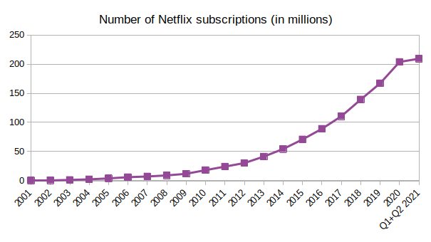
Here, we can clearly see that subscriptions to Netflix have been increasing over the past 20 years. This growth is particularly clear over the last 10 years.
Exercise 14 illustrates the principle of “cherry picking”: this principle applies when only a part of the data is shown. If we look closely, we can see that the graph only shows data from 23 to 26 June 2022. A graph spread over 12 months would look quite different:
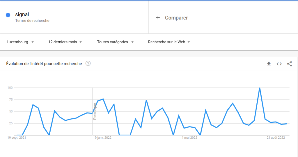
https://trends.google.fr/trends/explore?geo=LU&q=signal
On this graph, we can clearly see that the number of Google searches for the word “signal” frequently goes up and down.
Finally, exercise 15 demonstrates what happens if we use the wrong graph. In this exercise, we want to compare data which show what proportion of the population of Luxembourg uses a particular social media network. The sum of these percentages does not equal 100, but clearly exceeds 100%. This means that a pie chart is not at all appropriate for comparing these data.
In exercise 16, the idea is to show that graphs can be interactive and more creative than simple histograms. As an example here, we have chosen a graph made by the researcher Aida Horaniet Ibañez. Pupils first explore this graph on their own. Next, in a moderated discussion, they discuss what they have found out. If you see that pupils are having problems with the exercise, give them the following instructions:
- At the top, you can see a bar graph. Hover over the different bars with your mouse to see how many messages the person sent on that day in each language.
- Click on each circle in the languages to see what words were mentioned the most.
- Click on the words to see how many times they were used over time.
Exercise 11 on the enhanced memory can be set aside. This is the least important of the four superpowers, and the corresponding exercise is more complicated than the others.
In exercises 12 to 15 about the manipulation of graphs, the teacher can give extra hints to help pupils who are struggling.
In the section “Over the course of the lesson”, interactive visualization is explained in detail. The teacher is free to allow pupils to discover visualization on their own, or to give some tips to help them.
- The Luxembourgish context: The module was developed in collaboration with Aida Horaniet Ibañez, doctoral researcher at the Luxembourg Centre for Contemporary and Digital History at the University of Luxembourg. Moreover, numerous examples related to Luxembourg have been used.
- Differentiation: Depending on the level of the class or the pupils, the teacher can opt to give more or less support to pupils either to help them complete the tasks, or to leave aside some of the exercises.
- Media Compass: see the learning objectives set out by the Media Compass in the teaching analysis section in this document.
- The 4Cs model: Critical Thinking, Creativity, Cooperation, Communication. The 4Cs model is taken into account in different ways by the different social forms and teaching activities.
- Relation to current research: In the section More on this topic, the LUX: TIME Machine project at the University of Luxembourg is described and explained.
- Relation to research in Luxembourg: In the podcast at the end of the module, Aida Horaniet Ibañez talks about her research on data visualization at the Centre for Contemporary and Digital History at the University of Luxembourg.

Click on image to enlarge
Referenzen
Lupi, Giorgia & Posavec, Stefanie. (2013). Dear Data. http://www.dear-data.com/theproject
Lupi, Giorgia & Posavec, Stefanie. (2018). Observe, Collect, Draw! : A Visual Journal : Discover the Patterns in Your Everyday Life. Hudson, New York: Princeton Architectural.
Davis, Nicola. (2016). Can you get to know a person through data alone ? The Guardian. https://www.theguardian.com/artanddesign/2016/aug/21/dear-data-stefanie-posavec-giorgia-lupi
Tufte, Edward R. (2001). The Visual Display of Quantitative Information. Cheshire CT: Graphic Press.
Willett, Wesley, Aseniero, Bon Adriel, Carpendale, Sheelagh, Dragicevic, Pierre, Jansen, Yvonne, Oehlberg, Lora & Isenberg, Petra. (2021). Perception ! Immersion ! Empowerment ! Superpowers as Inspiration for Visualization. IEEE Transactions on Visualization and Computer Graphics, 28(1), 22-32.
